LOGO DESIGN
Boutique brand Toucan Kids wanted a logo for the launch of their online store that would be selling unique children's toys, clothing and gifts that weren't readily available on the high street.
With one of the key directives being to ensure that any design of the the hero toucan didn't look anything like the popular cartoon bird used by Guiness, work began in sketching out a variety of different birds.
Initial logo CONCEPTS
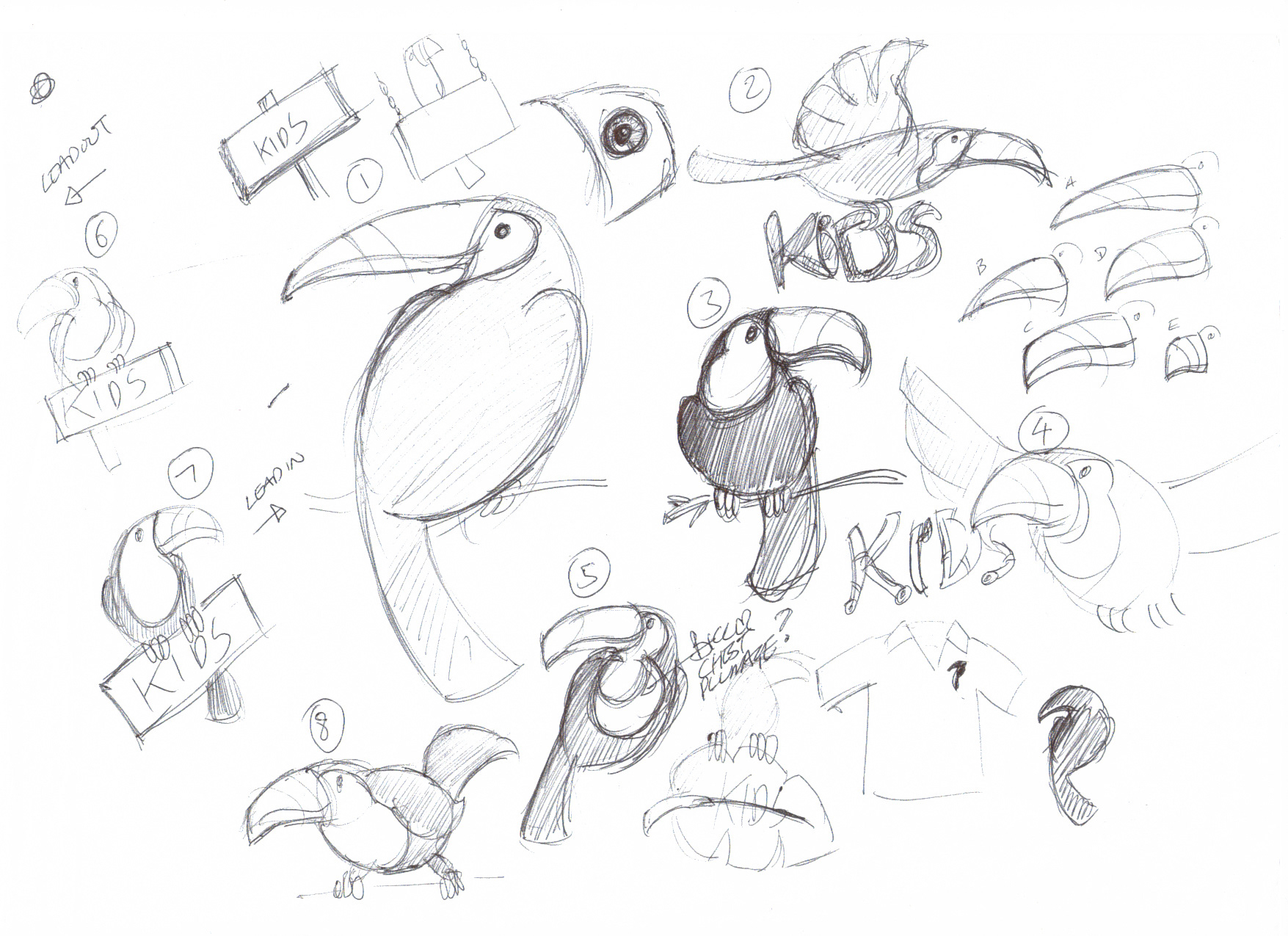
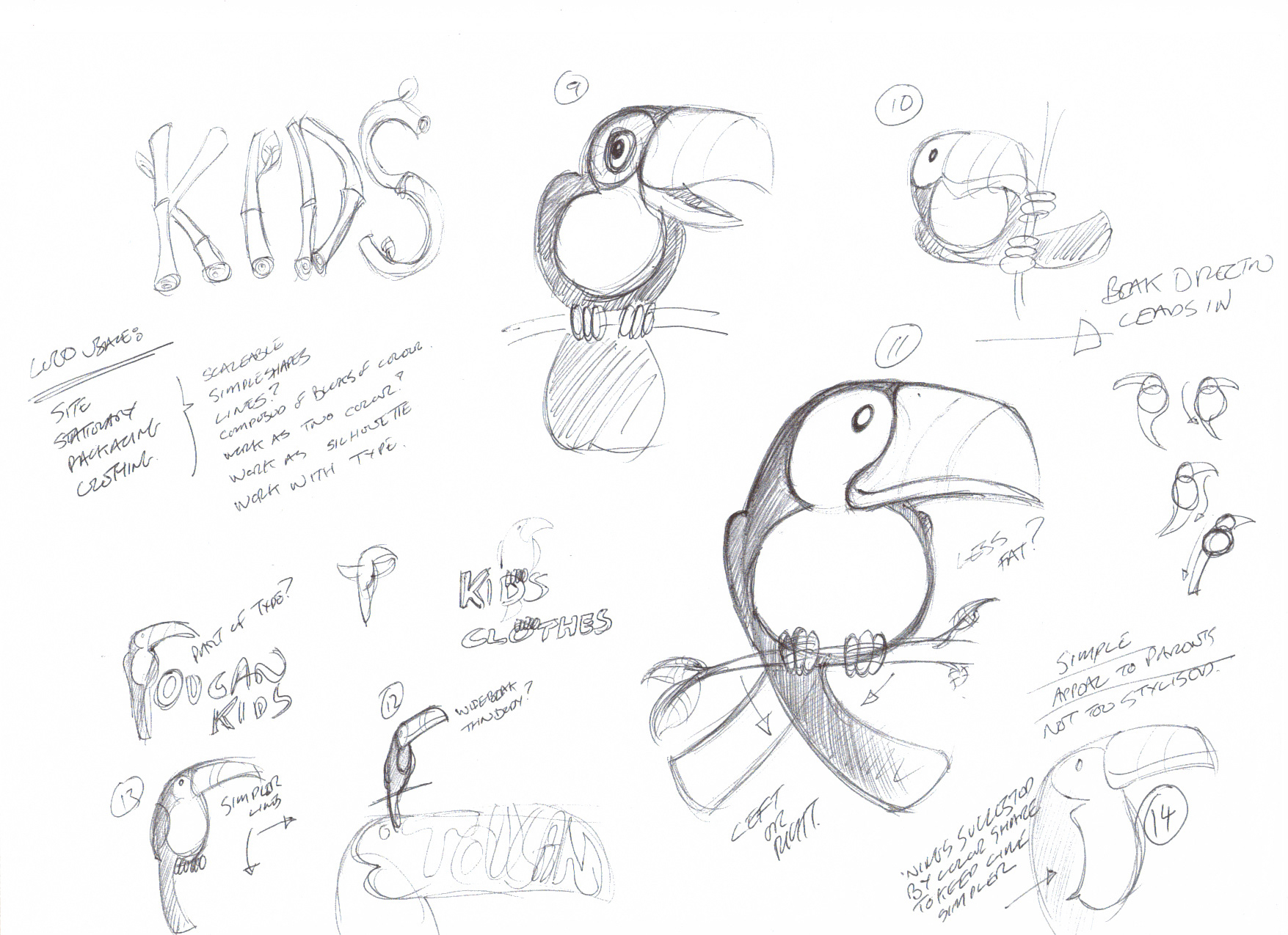
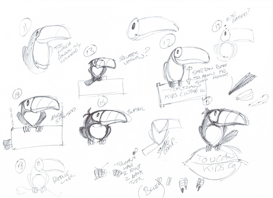
Initially, a more realistic depiction of the toucan was chosen by the client as the direction to follow and and the bird was worked up and exploration began into the incorporation of the main Toucan Kids typography with nods to the tropical origins of the bird or playful hints at the gifting nature of the store.
ROUND ONE LOGO EXPLORATION
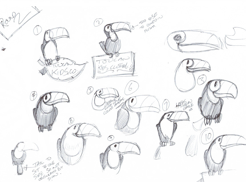
Upon reflection, the client decided that the depiction of the toucan wasn't unique enough to them so sketching resumed again with a few more variants worked up before settling on a simple shape and form variation of the toucan that focussed less on the detail and more on the flow of the flow of the toucan from nose to tail.
ROUND TWO LOGO TOUCAN DEVELOPMENT
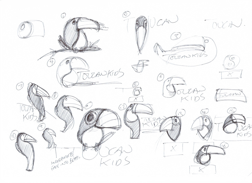
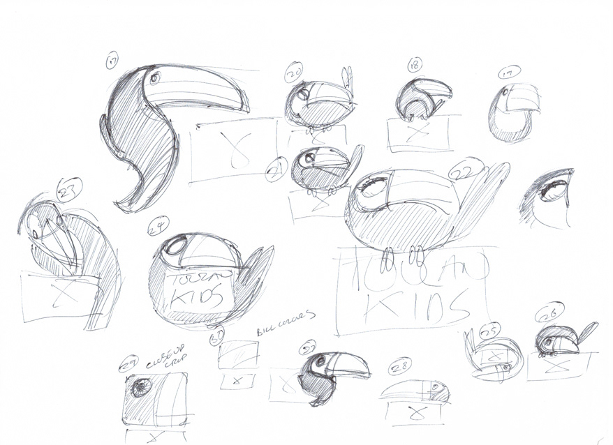
With a shape and form finalised, it was decided to move away from the toucans' natural dark colourings in order to bring a spalsh of colour to the brand. Taking cues from the myriad of colours that can be found on a toucan's beak, various colourways were trialled until a blue shade reminiscent of that around a toucan's eye was chosen for the main bosy colourway whilst keeping the beak a simple gradient so as to not overcomplicate the look.
Vector illustration font and colour trials
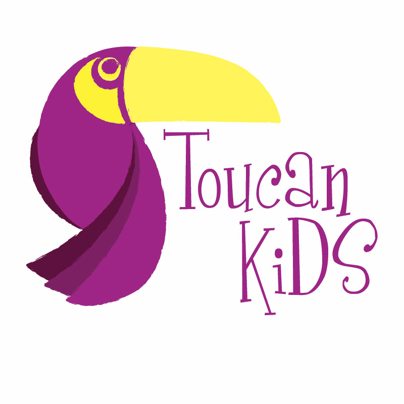
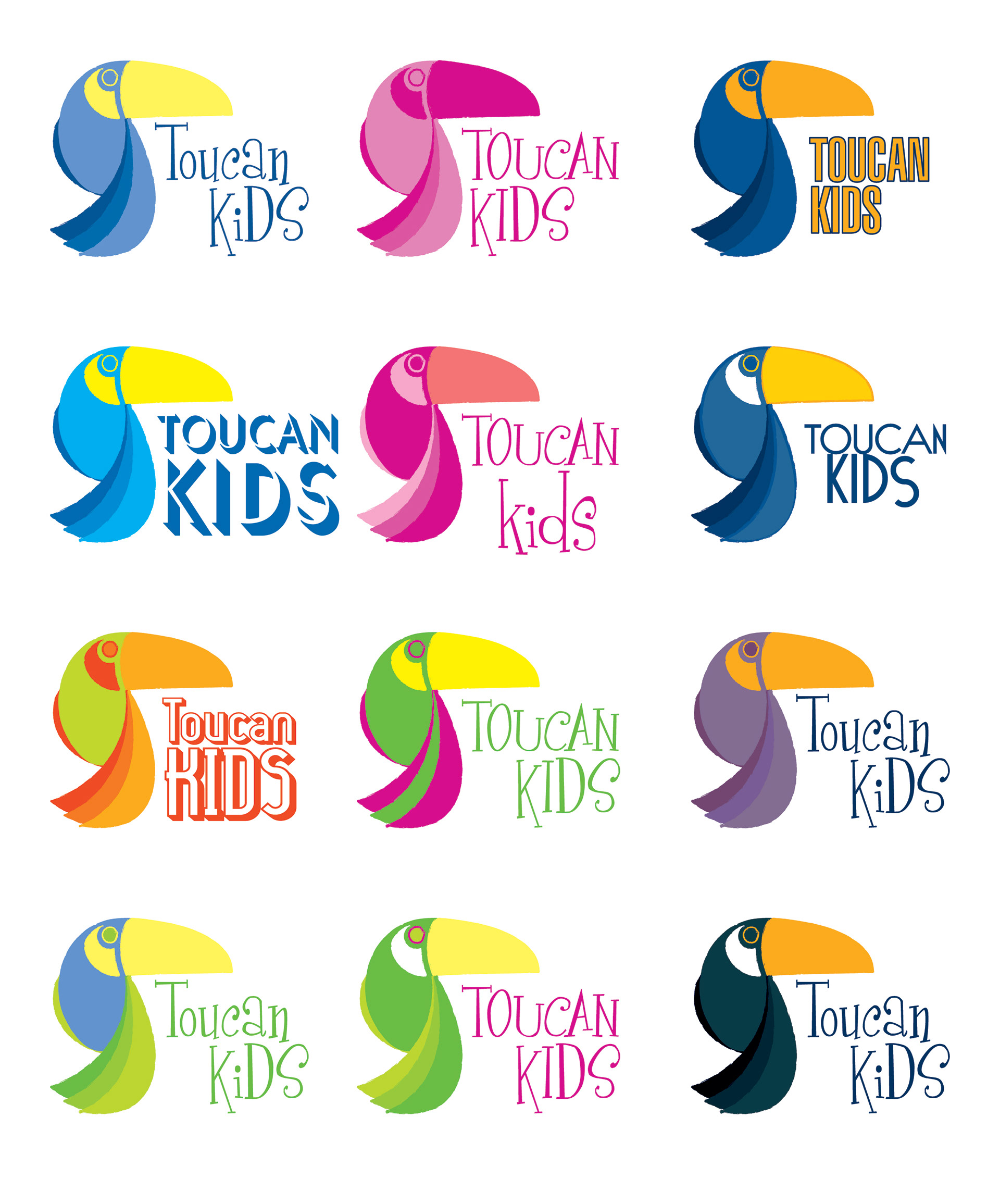
A variety of different fonts were explored for the main brand typography until a font in the style of a child's handwriting was chosen, coordinating well with the sketch like outlines that were applied to the toucan design to soften the silhouette and give it that child's drawing quality. Colours for the typography were matched to those found within the toucan's tail feathers with the words separated by colour rather than space.
Final logo
