LOGO DESIGN
As the Team Bear brand began to evolve and focus on fitness, both mental and physical, it was clear the existing logo needed to evolve too. Whilst the image of a bear was felt to be a strong symbol of physical strength, the execution looked more wolf like than bear and also didn’t signify fitness in any visual manner.
Upon further research it was also found that the old logo was actually readily available to purchase on a stock library for $12 and therefore not something that could be owned outright by Team Bear. This pushed the redesign work into overdrive.
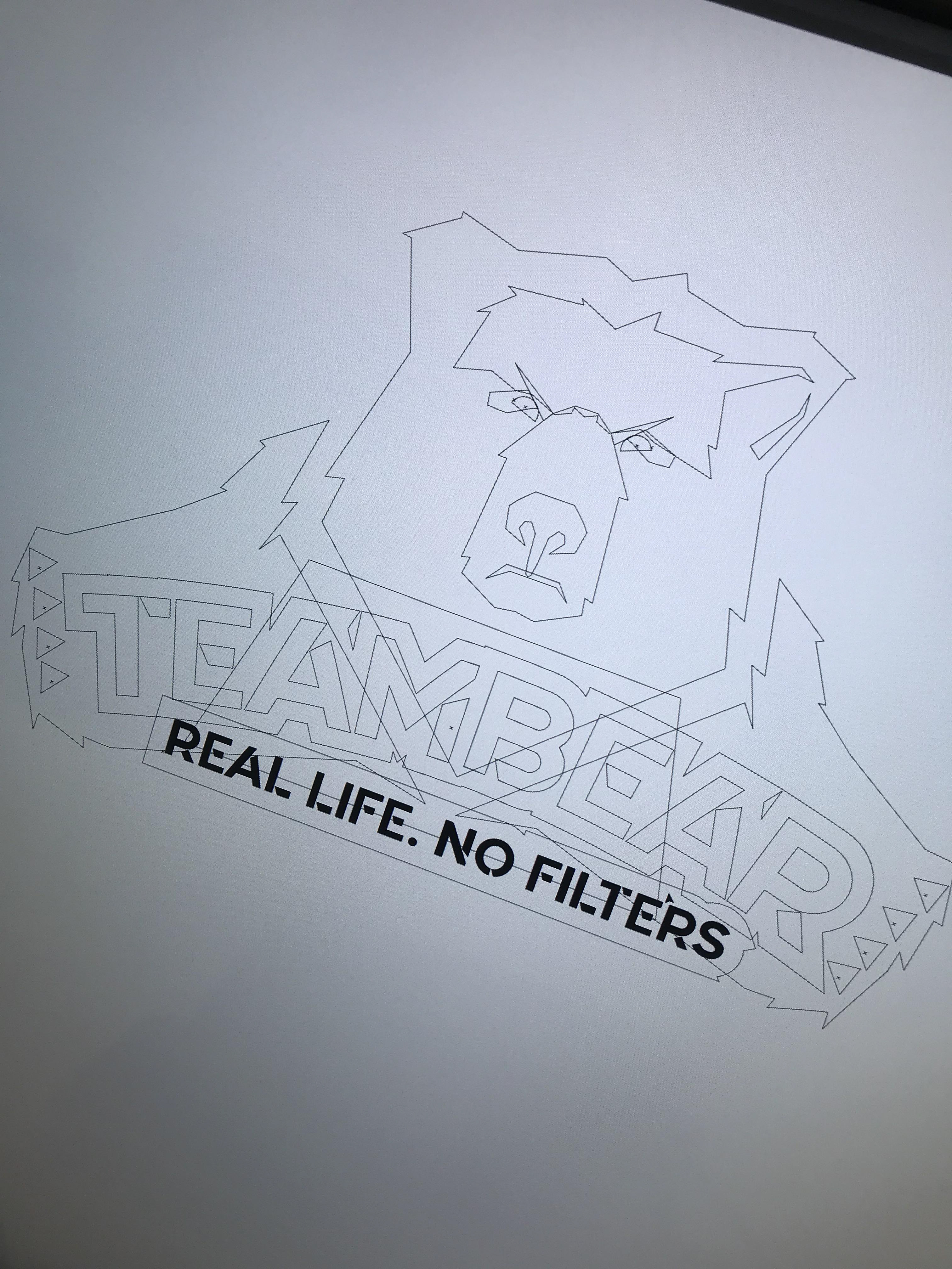
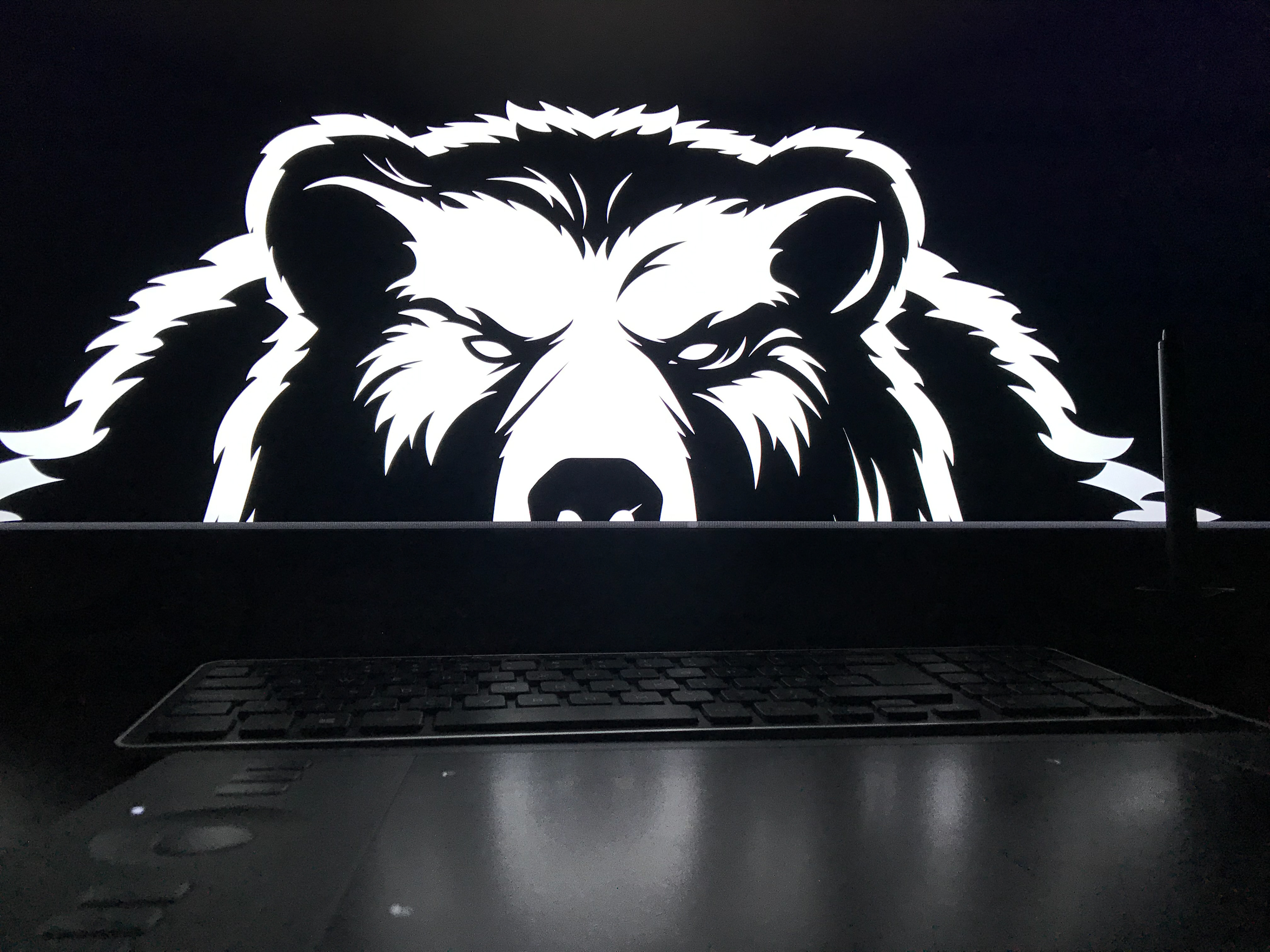
Embracing the spirit of Team Bear, the logo began to take shape into a creation that symbolized strength and protection in the form of a hulking grizzly whilst incorporating the logotype elements and a barbell for the bear to literally get its teeth into.
An alternative version was also developed aimed specifically at fitness for kids, in the shape of a friendlier looking version of the bear for Team Bear Cubs.
INITIAL LOGO WORKINGS
Finalised logos
Primary Team Bear Fitness logo
Secondary use logo for the children's side of the brand, Team Bear CUBS
Logo in use
