CONCEPTS • PROP CREATION • ART & SHOOT DIRECTION
As a fledgling brand, FUEL10K were looking to build on their core audience numbers and bring new followers to their channels. Looking back through previous posts it was noted that the art direction was very static and formulaic, framing a hero pack against an artistically arranged background of objects or ingredients in much the same way a recipe book does.
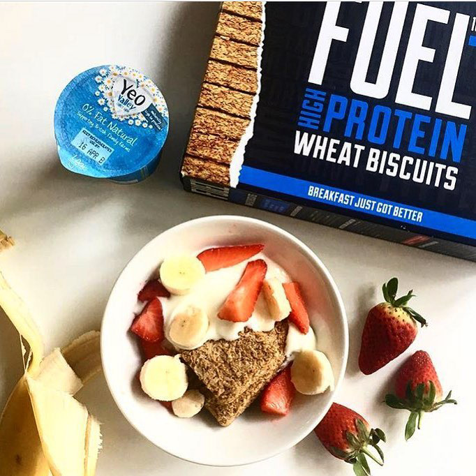
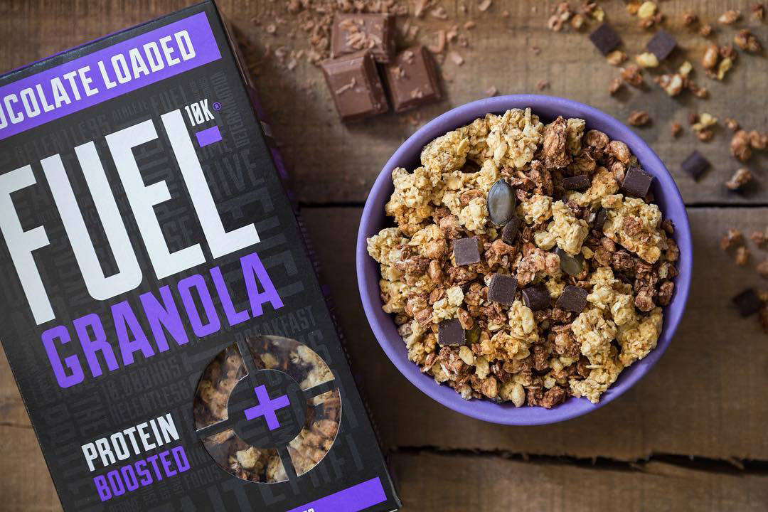
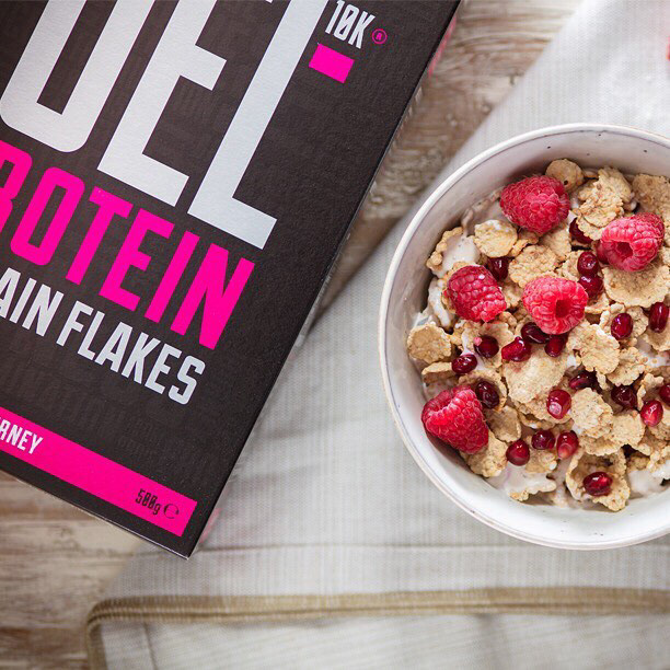
This approach demonstrated few of the product’s USPs but also did very little to give the brand any individual personality or unique voice in an already crowded product space. After several discussions with the founder of FUEL, taking on board their vision and passion, it was clear that this energy needed to be injected into the branded content.
Unique concepts were created utilising visually dynamic techniques that would stand out in the feed such as wobble gifs and kinetic typography that reflected the energy of the brand. An element of playfullness was also injected into the content, focussing on the brand’s USPs of quick and easy servings, portability and also the good it does by giving back to the sporting community.
Relevancy was also a key consideration and content was created that allowed FUEL to join in the online conversation. The first was for Star Wars day, creating an AT-AT out of FUEL packaging that proved one of the highest engaging and performing posts.
Another example was an April Fool’s day piece of content. Conceiving a completely new line of a squeezable pouch of peanut butter and jelly, a working physical pouch was created, filmed in action and then posted on April 1st. The audience engagement was such that people were messaging the channels inquiring where to purchase the new product from, whilst a supplier of the real pouches rang the founder of FUEL demanding to know why he was releasing a new product with a new supplier! All in all, the April Fools had worked its magic…

